
Design trends and web performance usually pull in opposite directions. The trend adds a video background, a custom font, a scroll animation and a chat widget; the performance budget pays for all four.
So this is the narrower, more useful list: the current design directions that make sites faster, and the popular ones that quietly cost you seconds.
What actually gets measured
Three numbers matter, and each maps to something a visitor feels:
| Metric | What the user feels | Target | Usual culprit |
|---|---|---|---|
| Largest Contentful Paint | “Has it loaded yet?” | Under 2.5s | Oversized hero image |
| Interaction to Next Paint | “Did my tap do anything?” | Under 200ms | Heavy JavaScript |
| Cumulative Layout Shift | “Why did it move?” | Under 0.1 | Images and ads without reserved space |

Trends that make sites faster
- System font stacks. Using the fonts already on the device removes a network request and eliminates the flash of unstyled text entirely. The typography is less distinctive; the page appears instantly.
- Server-rendered pages with light interactivity. The industry has swung back from shipping a full application framework to render an article. Sending HTML and adding behaviour only where needed is both faster and simpler.
- Native CSS instead of JavaScript. Scroll-driven effects, smooth scrolling, container queries and dialogs are now CSS or HTML features. Every one of these deletes a library.
- Honest static sections. A well-set text section with real content outperforms a carousel nobody swipes, and costs nothing to load.
- Dark mode via CSS variables. Cheap to implement, genuinely wanted, and it costs nothing at runtime when done with tokens rather than a second stylesheet.
Trends that cost you
| Trend | Typical cost | Cheaper alternative |
|---|---|---|
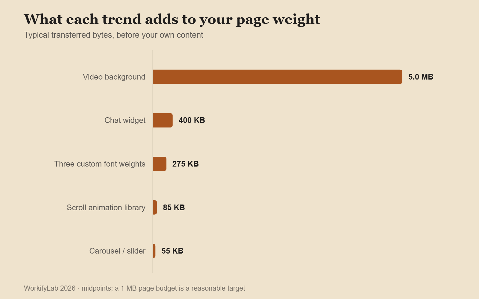
| Video background | 2–8 MB, high CPU | A still frame from the video |
| Three custom font weights | 150–400 KB, layout shift | One variable font, or system stack |
| Scroll-triggered animation library | 50–120 KB JS | CSS scroll-driven animations |
| Chat widget | 200–600 KB, loads on every page | Load on click, or a contact link |
| Carousel or slider | 30–80 KB, low engagement | Show the first slide as a section |
| Full-page loading animation | Delays content by design | Render content as it arrives |
The chat widget deserves special mention. It is usually added once, by someone in marketing, and then loads on every page for every visitor forever — often outweighing the entire rest of the site.

The images conversation, one more time
Images are still the largest thing on most pages, and the fixes are still the same three. They are boring, which is why they keep not being done:
- Serve the size actually displayed. A 2400px file in a 600px slot wastes 90% of the bytes.
- Use a modern format. WebP or AVIF typically cut file size by half or more at the same visual quality.
- Reserve the space. Set width and height so the layout does not jump when the image lands.
Do those three and most sites hit their Largest Contentful Paint target without touching anything else.
A budget beats a cleanup
Performance work done as an occasional cleanup always regresses, because nothing stops the next addition. A budget stops it: agree a maximum page weight and script count, and make anything that exceeds it a decision rather than an accident.
A reasonable starting point for a content site is under 1 MB per page and under five third-party scripts. Both numbers will feel restrictive, which is the point — they force the question “what does this earn?” every time something is added.

Common questions
Does performance affect rankings?
Yes, though less than content quality. The stronger argument is conversion: people leave slow pages without registering that they decided to.
Is a framework the problem?
Not inherently — how it is used is. A framework rendering static content on the server is fine. The same framework shipping its entire runtime to display an article is not.
How do I measure real-world speed?
Lab tools (Lighthouse, PageSpeed Insights) for diagnosis, field data for truth. Field data comes from real visitors on real devices, and it is usually worse than the lab number — sometimes dramatically.
Where should a small site start?
Images, then third-party scripts. That is most of the weight on most sites, and neither requires a redesign. The design decisions that make pages usable are a separate list — six principles here.
Leave a Reply