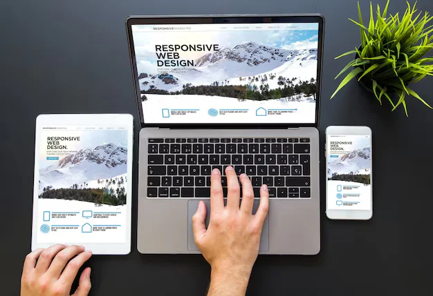
Responsive design stopped being a technique and became the default about a decade ago. Which means the interesting question is no longer “how do I make it responsive” — it is why so many responsive sites are still miserable on a phone.
The answer, almost always, is that the layout adapts and the content does not. Everything fits. Nothing is usable.
Fitting is not the same as working
| Technically responsive | Actually usable |
|---|---|
| Table shrinks to fit | Table scrolls, or becomes cards |
| Nav collapses to a burger | Top three destinations stay visible |
| Hero image scales down | Different crop, subject still visible |
| Sidebar stacks below | Sidebar content removed or moved up |
| Buttons resize | Buttons stay at least 44px tall |
| Text reflows | Line length stays 45–75 characters |

Tables are the hardest thing on a phone
A six-column comparison table cannot be squeezed into 375 pixels. Something has to give, and the three honest options are:
- Horizontal scroll inside the table only. Simple, keeps all data, and works — as long as it is visually obvious that it scrolls. An edge fade or a visible scrollbar is the difference between working and looking broken.
- One card per row. Each row becomes a block with labelled values. Best for tables people read row by row rather than compare across.
- Fewer columns on small screens. Show the two that matter, link to the full table. Honest, and usually the best experience.
What does not work is shrinking the font until it fits. That is the most common approach and it produces a table nobody reads.
Touch targets and thumbs
A mouse pointer is one pixel. A fingertip is roughly 45. Any control smaller than about 44×44 will be mis-tapped, and mis-taps at decision points cost you the visitor.
Two related things people miss:
- Spacing matters as much as size. Two correctly sized buttons touching each other still produce wrong taps.
- The top of the screen is hard to reach. On a large phone held one-handed, the thumb comfortably covers the bottom two thirds. Primary actions belong there, not in a top corner.
Images: same picture, wrong crop
A wide hero image scaled down to phone width becomes a thin strip in which the subject is unrecognisable. Scaling preserved the pixels and destroyed the point.
Serve a different crop at small sizes — taller, tighter on the subject. Modern HTML supports this natively with srcset and picture, and it costs nothing at runtime because the browser only downloads the one it needs.
Which is the other benefit: sending a 2400px image to a 375px screen wastes most of the bytes, and mobile is exactly where bandwidth is scarcest.
Test on the device, not the simulator
Browser device emulation gets the dimensions right and everything else wrong. It cannot show you:
- How the page feels on a real CPU throttled by heat
- Whether text is legible in daylight at arm’s length
- What the on-screen keyboard covers when a field is focused
- Whether the browser’s own chrome hides your sticky footer
- How the layout behaves with the accessibility text size a real person set
That last one catches a lot of sites. Increase your phone’s system font size to the level plenty of people actually use, then load your own page. If it breaks, it breaks for them every day.

Common questions
How many breakpoints do I need?
As many as the content needs, which is usually two or three. Breakpoints should be chosen by watching where your layout starts to look wrong as you resize — not by copying a device list that is already out of date.
Mobile-first, or desktop-first?
Mobile-first, mostly because it forces prioritisation. When everything cannot fit, you have to decide what matters — and that decision improves the desktop version too.
Is a separate mobile site ever right?
Rarely. Two codebases means two sets of bugs and one of them always falls behind. The exception is a genuinely different task on mobile versus desktop, which is uncommon outside large apps.
Does responsive design affect search ranking?
Indirectly and substantially, through mobile usability and page speed. But the ranking argument is the weaker one — the direct argument is that most of your visitors are on a phone right now.
Leave a Reply